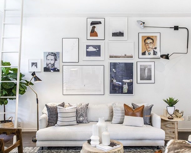
In terms of decorating a space, choosing and hanging art can be a daunting task. The art world can seem elite or exclusive, but it doesn’t have to be. With a few simple tricks and some great resources for purchasing art, you can have a great focal point in any room of your home. Here’s where to start:
Create a Focal Point
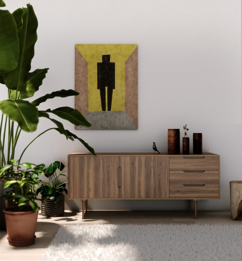
Art is a great way to anchor a space. It can be your first step to designing a room. Go for a large piece that takes up space—and also takes the pressure off putting together a gallery wall—and hang it at eye level. A big piece of art can be an investment, but one you can take with you and move around a room to consistently have a focal point. Pro-tip: When hanging large pieces of art (or a collection of art in the same space), aim for the center of the piece to be 57-60 inches above the ground.
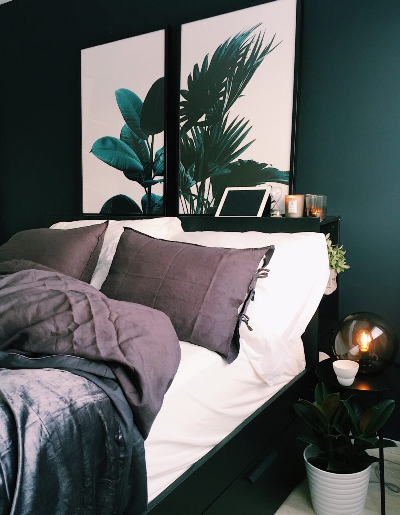
Mix and Match
When it comes to art and things you hang on the wall, it doesn’t all have to be matchy matchy. Having a cohesive feel for a space doesn’t mean it all has to be identical. Try using frames of a similar style (like a thin, wood frame) but in different colors. As for mats, it’s entirely up to the situation. Including a mat on a smaller piece of art adds importance and draws attention. Not every piece on the same wall has to have one, though. Same goes for content—default to the feel of the art, not necessarily the content. Think of mixing pieces that all contain florals as a focal point, but contain of mix of colors and formats like oil paintings, photographs, and sketches.
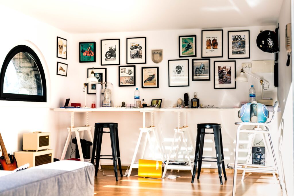
Spacing for the Space
The spacing of your art can make or break a room (no pressure). Make sure the scale makes sense—if you’re hanging art above furniture like a sofa or a console table, make sure your piece or pieces of art together are about two-thirds the length of the furniture. When hanging multiple pieces in a row, make sure the art has the same center point height, regardless of the height of the individual frames. And don’t space groups of artwork too far apart. The grouping (three or four pieces, centered on each other) should look as one piece of art and not disconnected. A good rule of thumb is art should be four to six inches above furniture and spaced only a few inches apart.
Don’t Hang It
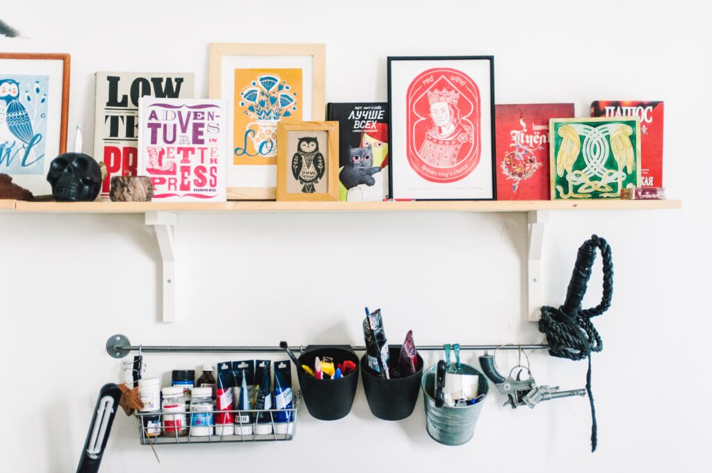
Who says you have to hang your art (not us)? Take advantage of space on bookshelves to tuck in some smaller pieces of art. Use floating shelves on a large wall to make a new version of the gallery wall: Pick pieces of similar content and style and prop them against each other on different floating shelves. This gives you depth and a new way to display favorite pieces.
Go With Unexpected
The fun thing about art is there aren’t many rules to follow. You can use art as a fun way to customize any space. Try something more eclectic like going asymmetrical and not centering your art. If you want to give it a shot, try with a small piece of art first. Hang it a little off center from what you would usually do, and build a wall from there. You also don’t need to stick with the traditional gallery wall. If you want the look of a wall of art, find an overall shape that’s more organic—mix small and large frames and formats of art, just achieve a balance. Try to keep smaller and lighter pieces in the upper right corner, and larger and heavier pieces in the bottom left corner.
Now that you know what to do with your art, it’s time to go buy some! There are plenty of online resources for prints, paintings, and posters for your own personal style. Here are some of our favorites:
This studio specializes in uncovering forgotten vintage art. Browse their extensive collection that has a heavy emphasis on 20th century modernism.
Minted isn’t just for thank you cards and save the dates. The website also offers fine art prints from their independent artists.
For something on the contemporary side, check out Citizen Atelier. The site also offers gallery-quality frames.
This online retailer offers prints and originals of art in the mid-century style featuring graphic prints in fun colors.
Talk about range. Art.com features pieces ranging from reprints of classics to modern abstracts and everything in between.
Cover Design & Photo by Urbanology Designs.

