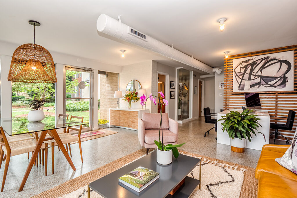
The GWRE team has a new home on a prime corner in Plaza Midwood. Over the weekend, Genevieve Williams Real Estate celebrated the grand opening of the new office space with a fall festival (complete with a petting zoo). The star of the event was the renovated space, featuring tons of natural light and the signature purple accents. Molly from Modish Co. who designed the space walks us through the process:
Q: What were your initial thoughts on seeing the space?
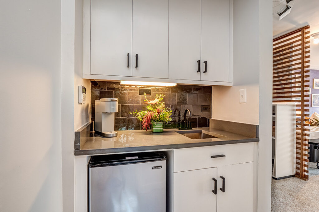
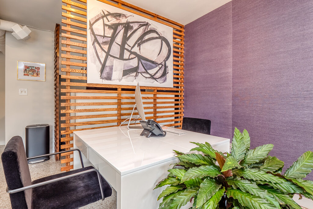
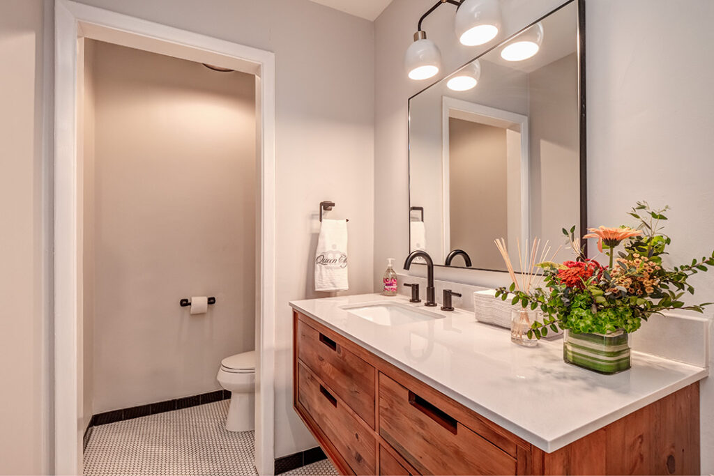
The space was small, so we knew some creativity was necessary to make it functional, but it was apparent right away that cosmetic changes and some minor remodeling could go a long way to transform the space significantly. We did paint and new light fixtures throughout, pulled up the carpet to expose the terrazzo floor, gave the kitchenette a facelift with new counters, hardware, and tile, remodeled the bathroom with new lighting, vanity, and tile, and then added functional changes like constructing the slat wall and adding cabinetry to conceal “ office stuff” and create additional storage space. Probably my favorite and most significant change was adding the floor to ceiling glass section to the former storage closet to make it a conference room that felt more connected and less isolated from the rest of the office.
Q: For the interior design, what did you draw inspiration from?
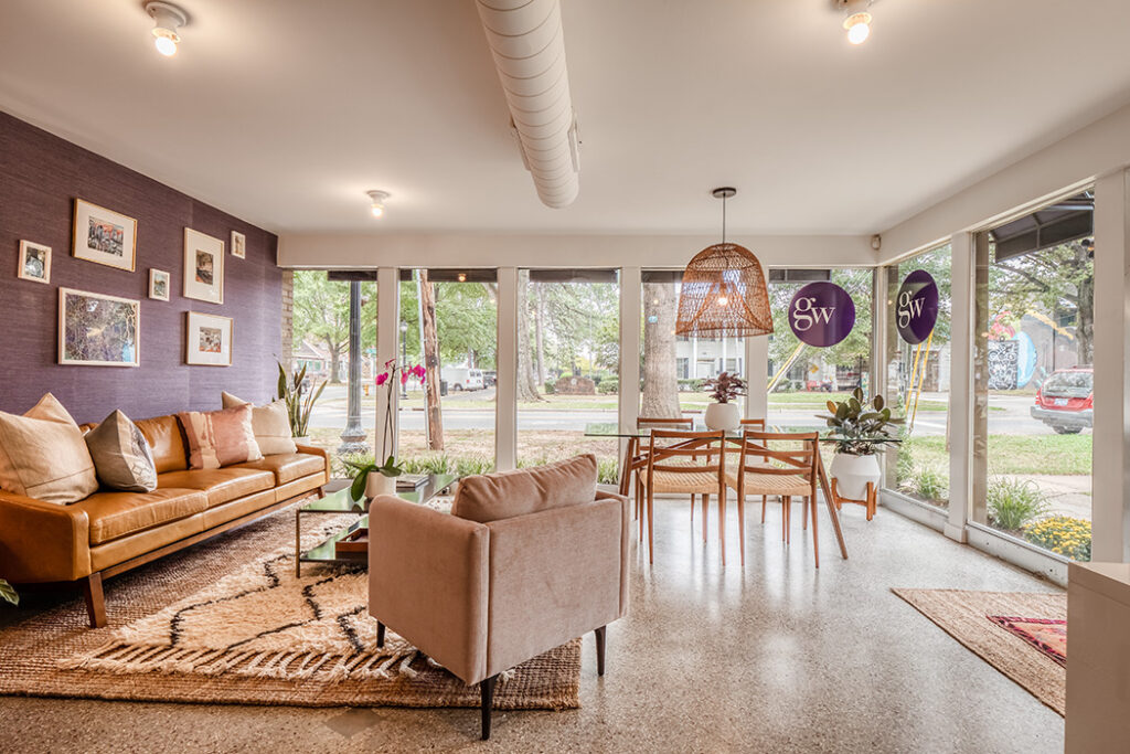
We wanted the space to feel collected, inviting, and interesting—and aimed to break away from the average office environment. Some great offices we pulled inspiration from were the headquarters of One Kings Lane, McGee and Co., The Every Girl, and Who What Wear—a few examples of a stylish mix of furnishings in an office that is warm and creative. Gen’s personal style was also a big source of inspiration, and we also wanted something that fit the eclectic and trendy vibe of the surrounding of Plaza Midwood neighborhood. I wanted the space to be representative of Gen’s style while complementing the GW Real Estate Branding. Midcentury modern with an upscale bohemian flare is how I would describe the general vision as our jumping off point. I also love that the office is run by women, but we wanted to be careful that it didn’t become too feminine. We really worked carefully to balance warm woods and masculine accents with the more feminine flare and purple pallet to keep it welcoming to everyone.
Q: The space isn’t huge. What are some things you did to make it seem more spacious?
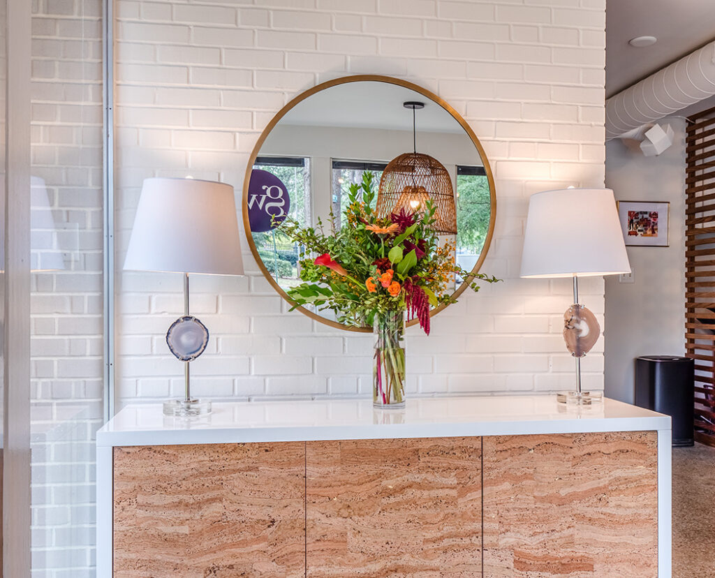
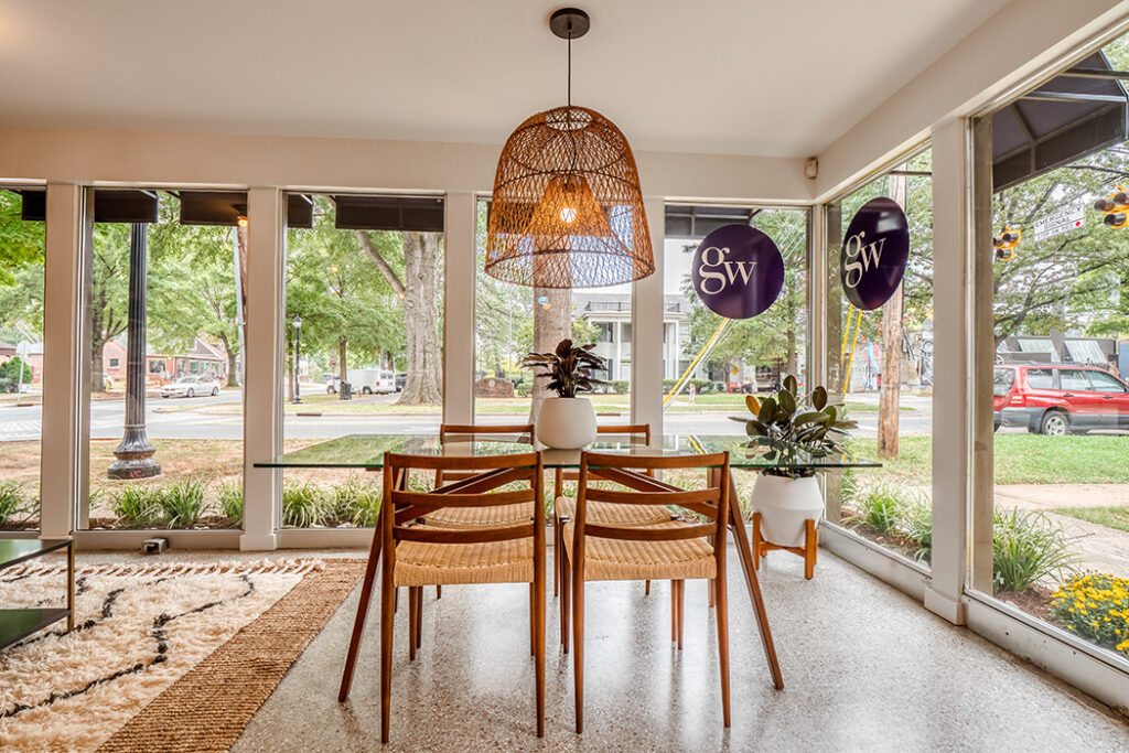
This was certainly a challenge since we wanted to incorporate a lot of function into a tight space—an enclosed meeting/conference area, multiple desks, a communal work area, and a comfy seating area that all worked together to create an inspiring and comfortable place to do business. Adding the glass opening to the former closet transformed it into a conference room and made it feel connected to the rest of the office, while creating a lot of visual space from both inside and outside of that room—that made such an impact! We also wanted to do our best to disguise necessary, but unsightly, office clutter like a large printer/copier and miscellaneous supplies and paper goods by adding cabinet storage in an existing, but awkward nook, adding hanging hooks for signs to keep them from being piled on the floor, and constructing the slat wall to create a barrier that was more sculptural and not as intrusive as building a real wall that would close off the space and make it feel even smaller. Adding functional furniture like the entry console that could also double as storage was helpful with keeping it stylish, yet functional. The rest was left to a thoughtful layout and designating the space properly with furniture that was the right scale that allowed us to accomplish everything on the wish list. Smaller, but functional desks that could be joined together, a glass top table that was functional but also didn’t take up too much visual space in a small room, and lounge furniture that was properly sized made it all come together perfectly.
Q: For this space, where did you splurge and where did you save?
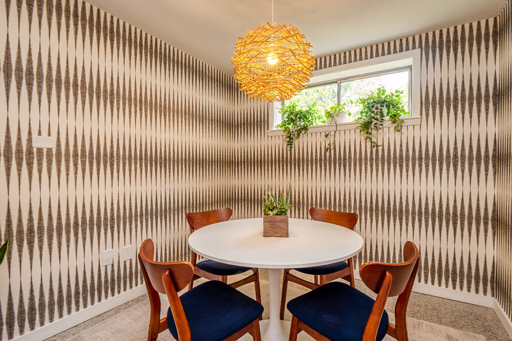
We tried to keep the remodeling costs as modest as possible without sacrificing style. We were able to stick to affordable big box stores like Lowes and Home Depot for the tile, vanity, and cabinet hardware, but upgraded on the light fixtures and accents. When we ripped up the carpet and discovered the original terrazzo floors underneath, we decided to buff them and work with them instead of replacing it with brand new flooring, which was the original plan—and that was a big saving. Adding the slat wall to create a faux closet and cutting the glass enclosure to the conference room hit the budget a little harder, but were well worth it. Both were transformative to the space and served a very functional purpose. The wallpaper was more of a splurge, but the space wouldn’t be the same without them! Wallpaper adds whimsy, pattern, and color, and ties everything together!
Q: You incorporated several different textiles and textures in the office. What are the rules of mixing textures and patterns?
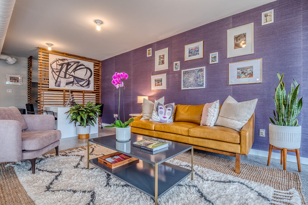
Texture is a great way to bring warmth and add dimension to a room to keep it from looking boring or sterile, but it can be a balancing act to keep it from getting too busy. I like to incorporate texture that’s subtle but impactful—the cork front of the entry cabinet, the woven seats of the chairs at the communal work table, grass cloth wallpaper, and the basket light all work to bring texture that creates interest without overwhelming the space. The warmth of these textures works to complement the wood tones throughout, but provide a contrast with the colder terrazzo stone floors and are also neutralized with the accents of black and white to give the eye a place to rest. The more masculine, warm-toned leather sofa is softened by the velvet chair, pillows, and plush rug. It’s all about balance so they work in harmony, not compete with each other.
Q: Where are your go-to shopping destinations when designing a new space?
Absolutely everywhere, but each project is different depending on the style goals and budget. I loved CB2 and West Elm as a main resource for furnishing this project because of their modern style and functional office pieces, but also quick shipping! We sourced the entry storage cabinet, desks, oversized basket light fixture, and bathroom mirror from CB2. The glass top work table and woven seat chairs are from West Elm, along with the conference room chairs and seating area rug. I love Schoolhouse Electric and Shades of Light for light fixtures—lighting throughout the office was selected from there as well. Locally, we checked out Slate Interiors for some interesting rugs and vintage accents. We bought the face pillow from Slate, which was made by a local textile artist Chris Keogh—we loved that so much and thought it was the perfect addition. Etsy is also my go-to source for vintage, one-of-a-kind rugs, and you can find some amazing deals! Also, we could have really splurged on the leather sofa, but the lead time for a custom made sofa was several months and after considering the major investment for a piece in an office space that would get a healthy amount of wear on it, we decided it was more practical to order from All Modern. They have some awesome genuine leather sofas in stock that are great shapes and ready to ship within a week or two, and are much more affordable compared to other custom options.
Photography by: Paul Rauch, Summit HD Media


